CASE STUDY:
Therapist Website Redesign
Background
Monica Chernoff, a SoCal-based therapist specializing in athlete mental health, draws on her experience as a former collegiate water polo player to connect with her clients. Two years after earning her Master’s from USC, her practice started to pick-up, but her self-built SquareSpace website remained outdated. In September 2023, she decided to refresh her site with a more professional and evolved look. Her redesign goals were to enhance client engagement, improve user workflow, and update the interface.
Target Audience: Athletes across Northern and Southern California
Problem: Outdated and inefficient website
Solution: A redesigned site with improved UX, UI, and SEO for better accessibility and engagement, and traffic
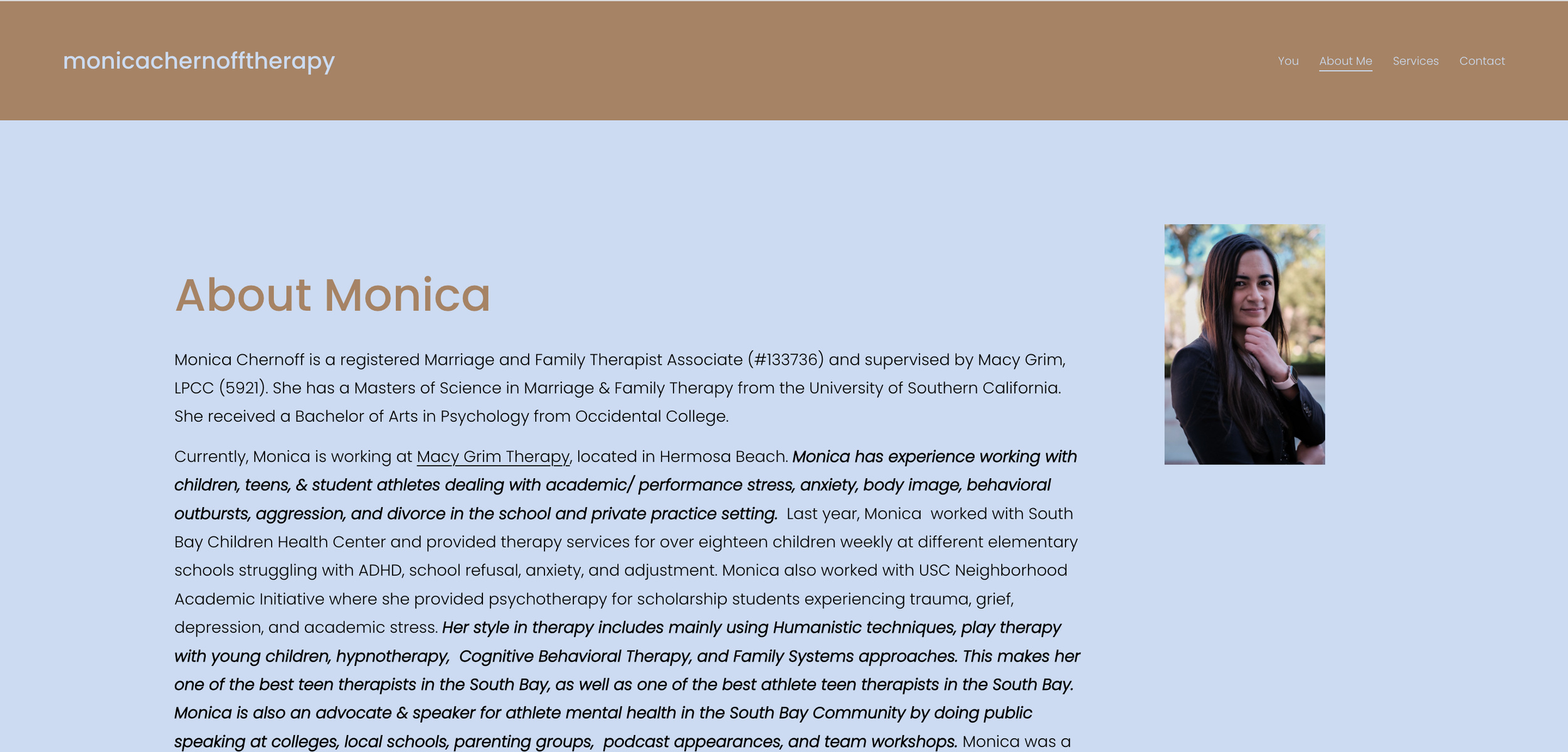
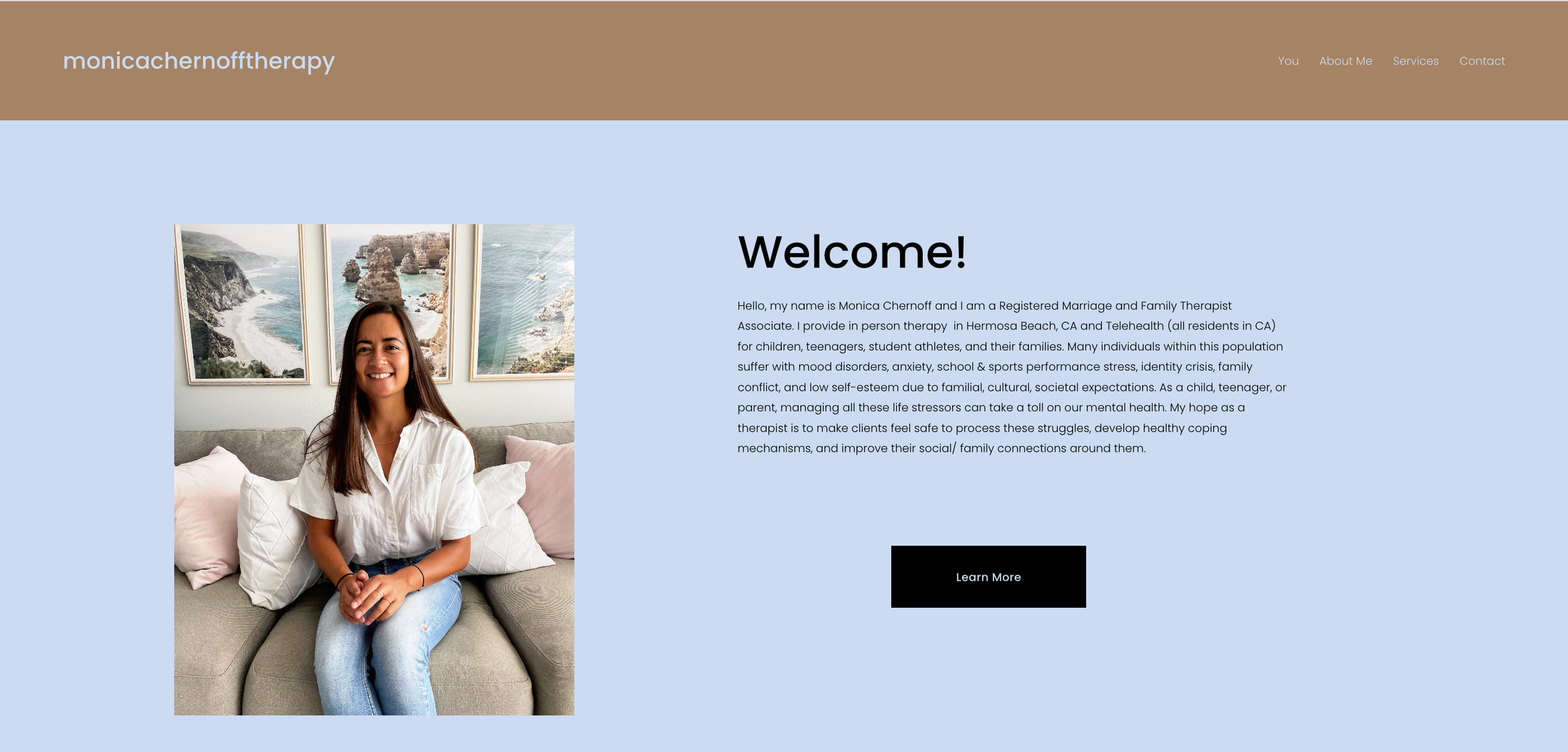
How the website looked before…
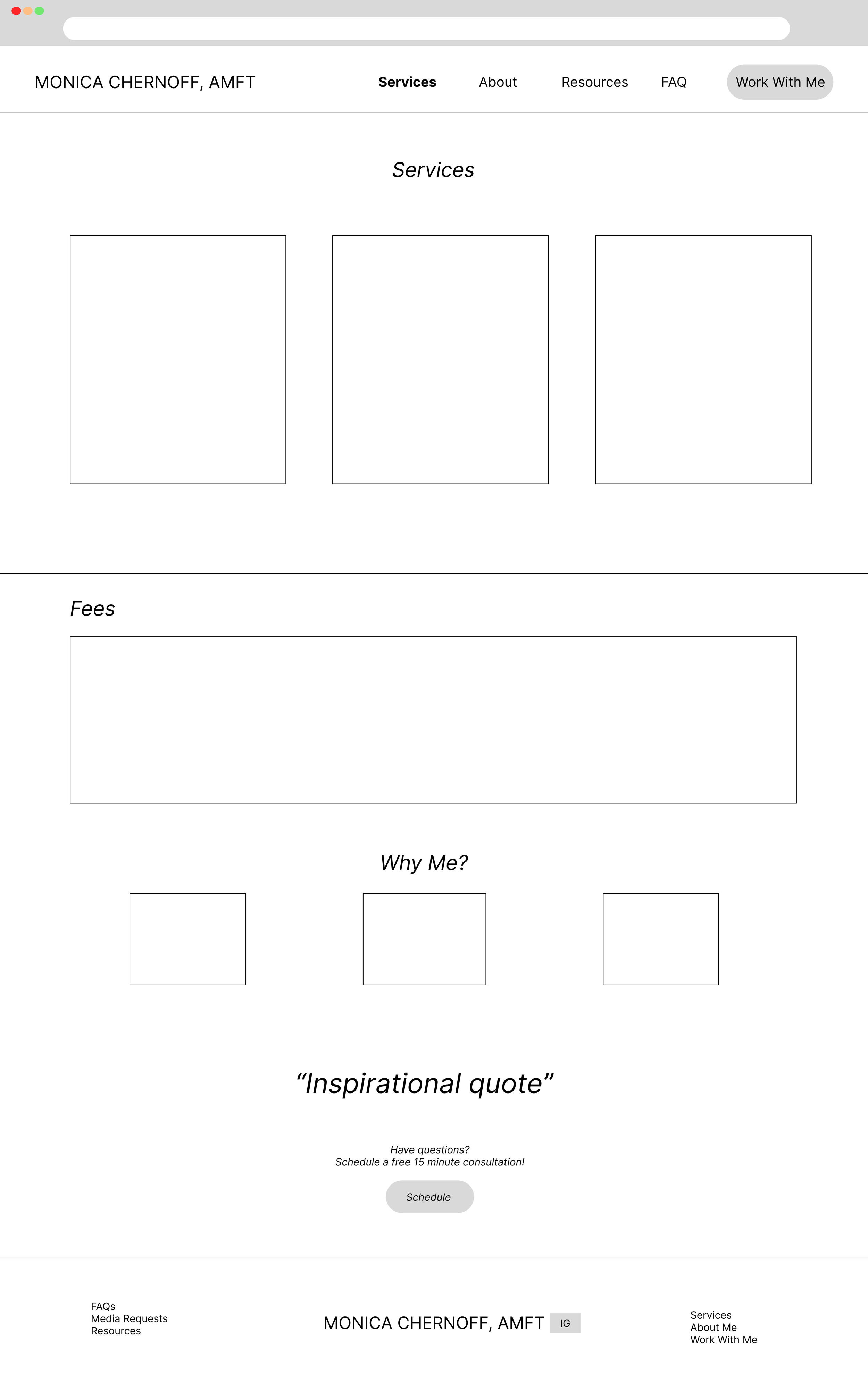
Wireframes for the glow-up:
-

Home page
-

About Me
-

Services
-

FAQs
-

Resources
-

Work with me
What anchored the glow-up?
Heuristic, Competitive Analysis, and User Surveys
Heuristic Analysis
I conducted a heuristic evaluation to gauge the effectiveness of how users would interact with Monica’s website. The list of areas of improvement are noted above with the “Before” photos.
Competitive Analysis
Additionally, I conducted competitive research that identifies and compares different features that are commonly seen in therapist websites as of 2023. I compared five different therapist websites and used an Excel sheet to measure my data (see photo below). Based on my analysis, I discovered that common sections on their website were: Background information about the therapist, services they offer, and a form for future clients to contact them.
Surveys
Finally, I gathered more thorough target audience feedback by creating a survey on Google Forms. Monica distributed it to ten people who anonymously responded to the three-question survey. The questions were the following:
What did you like about this website?
Did you face any challenges while using this website? If so, please explain.
What can be improved about this website?
Survey Feedback
Findings
From all the user experience research conducted above, I was able to determine that the following pages were needed within the website:
A “Home” page, where potential clients can be introduced to Monica’s practice
An “About Me” page, where potential clients can learn more about Monica’s qualifications and experience
A “Services” page, where potential clients can find more details about her policies, fees, and services
A “Contact Me” page, where potential clients can book an appointment, ask questions, book a free consultation, etc.
A “Frequently Asked Questions” page, where potential clients can see answers to frequently asked questions about Monica’s practice
Additionally, I suggested to the client to offer something for free on her website to assist with building trust with her target audience. She decided to go with a mental health resources page. She loved the idea of further educating her current and potential clients beyond their sessions.
Now the fun part…
Wireframes & Design Implementation
I created wireframes for Monica’s future website based on the user research above. My main objectives were the following:
The flow of information: Monica had a lot of the right information on her website, she just needed assistance with placement
The user interface: The website lacked cohesion in design, spacing, and sizing
The removal of the “You” page: There was a lot of confusion about why there was a “You” page when it had information about Monica instead of information that was more user-specific
Add more opportunities for contact: The website only had two places where the user could easily contact Monica
The photos: Some of the photos on the website had either too casual tone of a tone or did not relay information about her professional experience
Credibility: The website needed to create more trust between Monica and her potential clients
Conclusion
Monica’s website redesign enhanced the user experience to reflect her professionalism and expertise. I focused on creating an intuitive, trustworthy site with streamlined navigation, making it easier for clients to book and explore her services.
With simple yet powerful SEO improvements, her visibility has increased, leading to an average of four client inquiries per week. The final design strengthens her online presence, making client connections smoother while maintaining her professional image.
Big thanks to Monica for letting me be part of this project! To learn more about her practice, visit her website here.


