Designing a user portal for
BACKGROUND
THE COMPANY
Hook & Go Logistics is a safety and compliance company that helps professionals start and maintain a trucking company. It’s the only one-stop-shop for purchasing an active trucking authority and maintaining compliance
Objective: Create a user-friendly web portal for clients to view, manage, and upkeep their compliance deadlines
Timeline: The timeline was tight - there were only about 3 months until the launch date
My responsibility: As the product designer, I was responsible for UX research and interface design of the user portal. I collaborated closely with Jared Woods (CEO) and Omkar Moghe (Software Engineering Lead) to execute Jared’s vision.
DESIGN PROCESS
I knew nothing about the trucking field.
User Interviews and Research
I made sure to pursue an extensive research process due to my lack of knowledge about the trucking field. For research, I conducted four user interviews and thorough independent research to assist with executing the client’s design and business goals.
USER INTERVIEWS
To gain deeper insights into the needs of trucking company owners, I conducted interviews with three existing H&G clients and the CEO, who also owns a trucking company. Each interview lasted 20–25 minutes, focusing on key areas such as daily operations, challenges, and expectations for a user portal. The questions included:
Describe your typical day as a trucking company owner.
What are some challenges you face in running your business?
What goals are you trying to achieve with our user portal?
Think of a user portal you enjoy using—what makes it effective?
These interviews helped me understand the real-world pain points and desired solutions from our target users.
INDEPENDENT RESEARCH
In addition to user interviews, I conducted independent research on trucking compliance requirements. Using the FMCSA (Federal Motor Carrier Safety Administration) website, I explored key compliance factors that impact trucking companies. I also analyzed industry-leading online tools like Motive, AscendTMS, and Transport Pro, which assist companies with safety, compliance, and operations management.
This research provided valuable context for designing a user portal that effectively meets industry standards and addresses real user needs.
Biggest Takeaway: Trucking company owners are booked and busy
Trucking safety and compliance involve managing multiple deadlines, legal documents, and fee payments. H&G’s target audience needs a user portal with a clear user flow, a minimalist interface, and seamless organizational features to simplify compliance management.
Next steps: Information architecture and wireframes
Jared had a list of design preferences and requested integrations with specific softwares he was already using for his business (Square and Motive). It was great to start the design process with a foundational style that was also familiar to trucking professionals.
Layout examples of the design preferences that Jared had, these screenshots are from Motive and Ascend TMS
I analyzed user research, Jared’s design preferences, and features from Motive and AscendTMS to develop the information structure and wireframes. Through meetings with Jared and Omkar, we refined key elements, including:
Assets Tab – Editing vs. viewing modes, CRUD structure, data requirements, export/import options, and customization.
Security – Two-factor authentication.
Accidents Tab – Potential integrations.
Dashboard – Key display elements.
Alerts – Calendar vs. list format, opt-in/out options.
Additional Features – Audit & Testing tabs, FAQ structure.
These discussions shaped a streamlined, user-friendly portal.
Information Architecture Sketch
Wireframe sketches
Once the basis of function was defined, I was able to start designing.
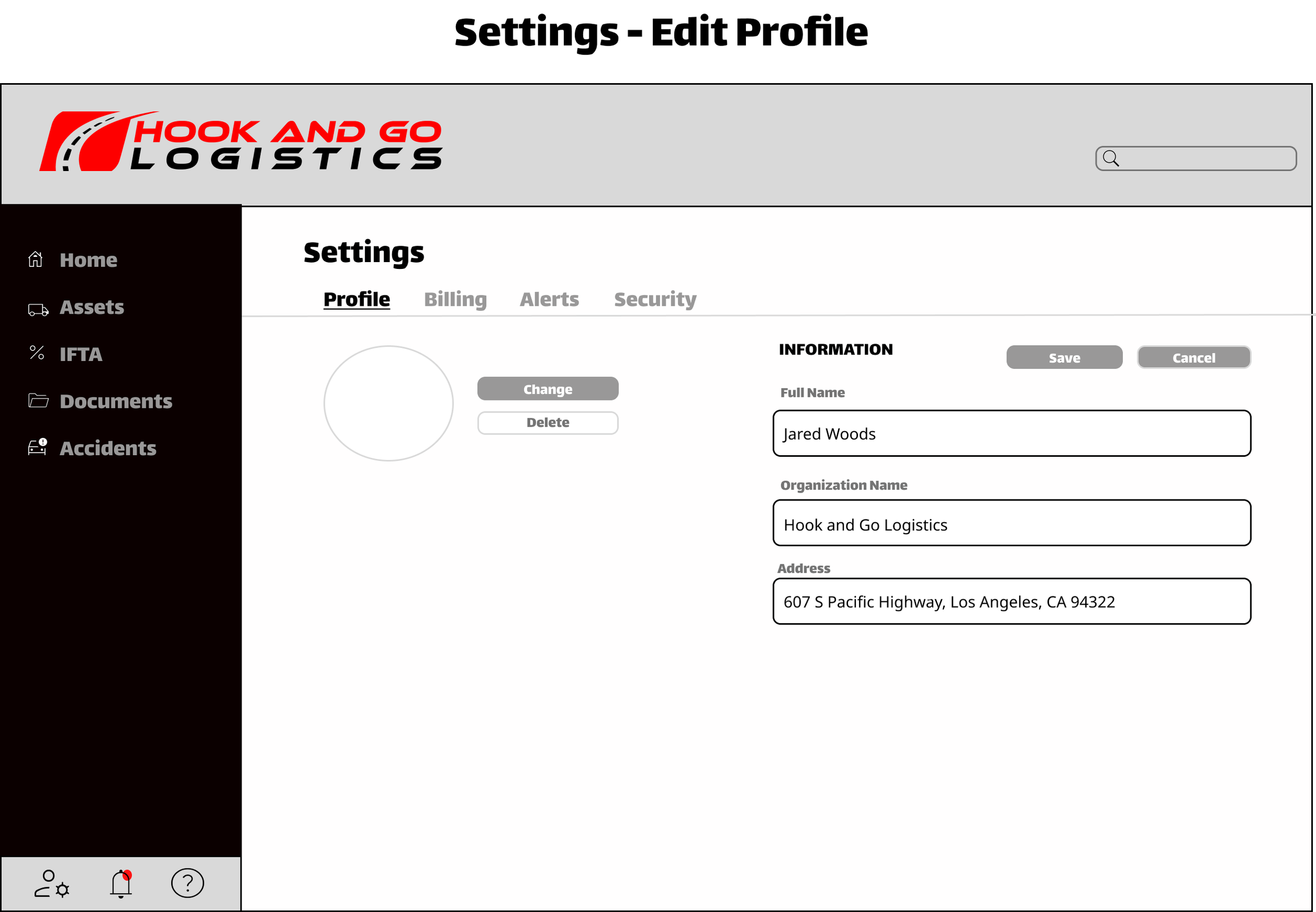
I used the wireframe sketches and information structure to bring H&G’s first user portal to life with Figma. The UI followed all brand visual guidelines Jared requested. The following was discussed and changed during the design process:
Implementing thinner lines and borders for a more minimalistic and sleek view
Replace rounded outlines with a slightly rounded rectangle
Adding icons to each tab and actions
What color coding system should we use to display the different statuses in the IFTA tab
How to differentiate the edit v. view display across the user portal
Changing fonts
Placement of the profile, alerts, and FAQ’s icons
FINAL SCREENS (NEW USER & EXISTING USER)
DASHBOARD BREAKDOWN
OTHER NOTABLE FEATURES
The table views provide a structured, spacious interface for efficient CRUD actions.
A drag-and-drop feature speeds up document uploads, with an option to browse files manually.
The standout feature is the Alerts Tab, making H&G unique as the only service offering an opt-in/out alert system for tracking compliance deadlines.
Overall thoughts
CHALLENGES
Time Constraints – The short timeline meant some features, like the Motive integration, Testing tab, and Audit tab, had to be removed.
Scheduling Conflicts – Coordinating across time zones and limited availability of the CEO added complexity.
TAKEAWAYS
This project felt like a game of Tetris — juggling design, content, and client schedules. Between refining my active listening skills and hyper-focusing on design details, I felt like I unlocked a new level of product design! In the end, I wrapped up the project on time and handed off the building portion to the engineering team. I’m so grateful to have been part of such an amazing project, and bringing Jared’s vision to life was truly the highlight. Huge thanks to Hook & Go Logistics.


